
Process of Interaction Design
Skills Demonstrated
UX Research (Think-aloud protocol)
Information Architecture
Interaction Design
Lo-fi Sketching
Prototyping (Figma)
Usability Testing
Cognitive Load Analysis
Team Collaboration & Iterative Design
Team & Tools
Team Members: Rola Hussein, Simone Kruse, Chi Vo
Tools Used: Figma, Zoom, Google Docs, Paper Sketching, Think-Aloud Protocol
Overview of Design Process
1. Empathize & Define
Students are overwhelmed by fast-paced workloads.
NotebookLM is widely used, but unclear visibility and unreliable summaries slow students down.
Needs identified:
Save time
Clarify concepts
Manage multiple sources in one place
2. Ideation (Sketches)
Insert sketches:
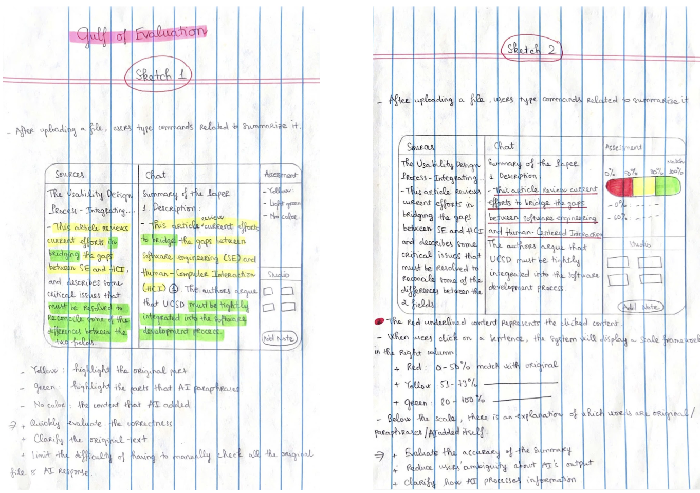
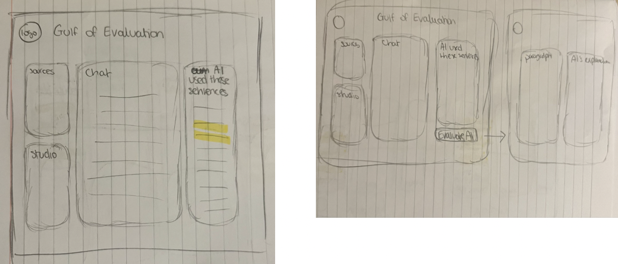
Gulf of Evaluation sketches (Sprint 1)
Visibility sketches (Sprint 1)
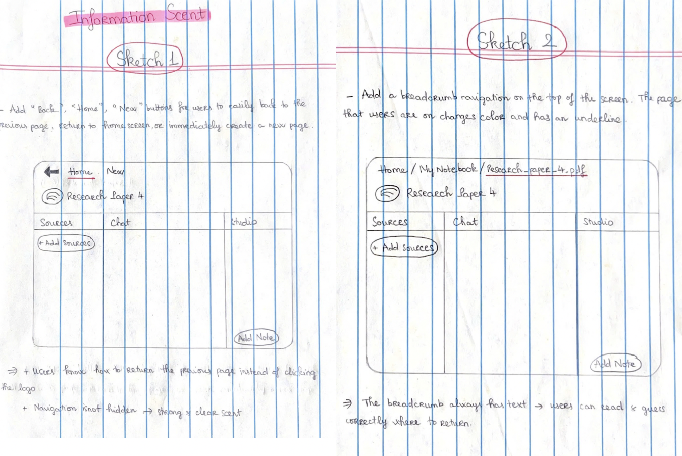
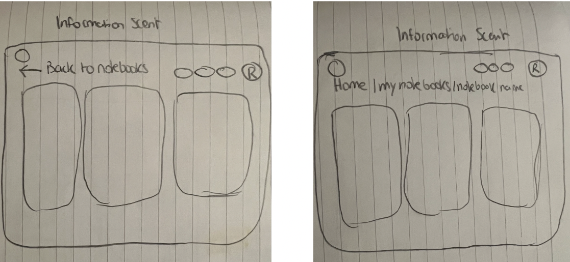
Info Scent sketches (Sprint 1)
Each team member sketched 2 redesigns per concept.
We then selected the strongest redesigns collaboratively.
Gulf of Evaluation
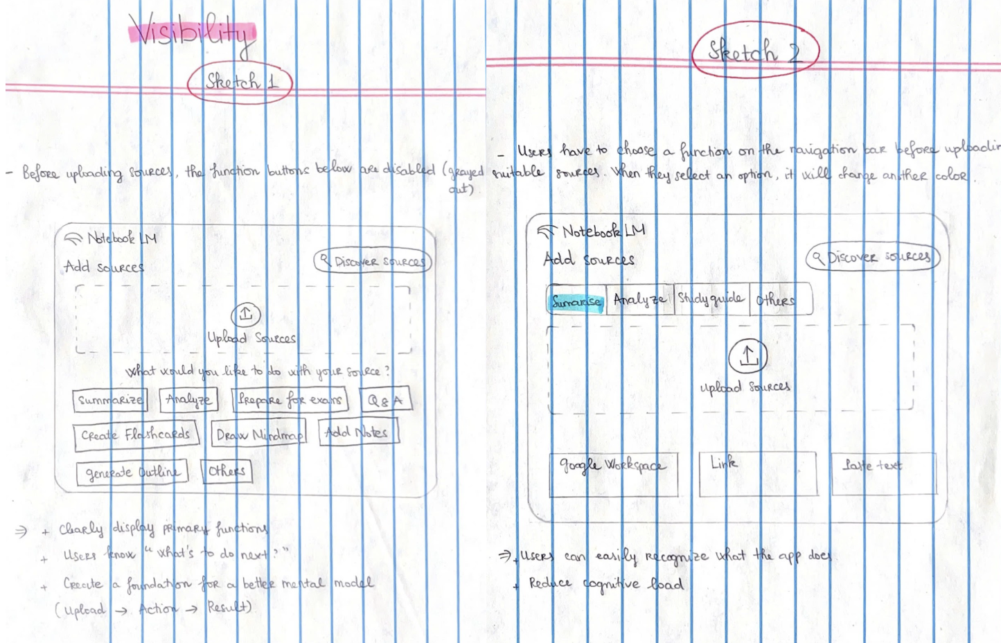
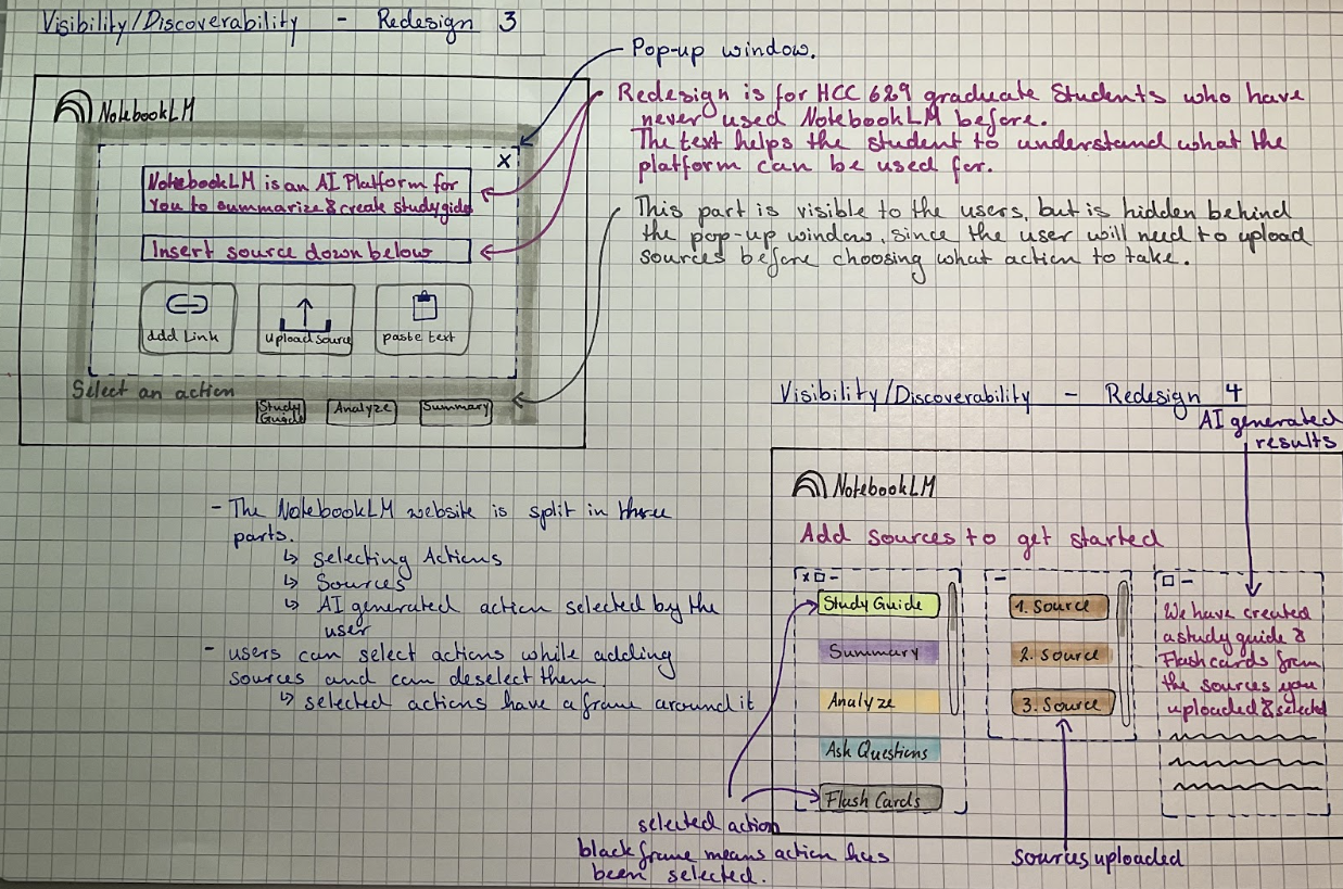
Visbility
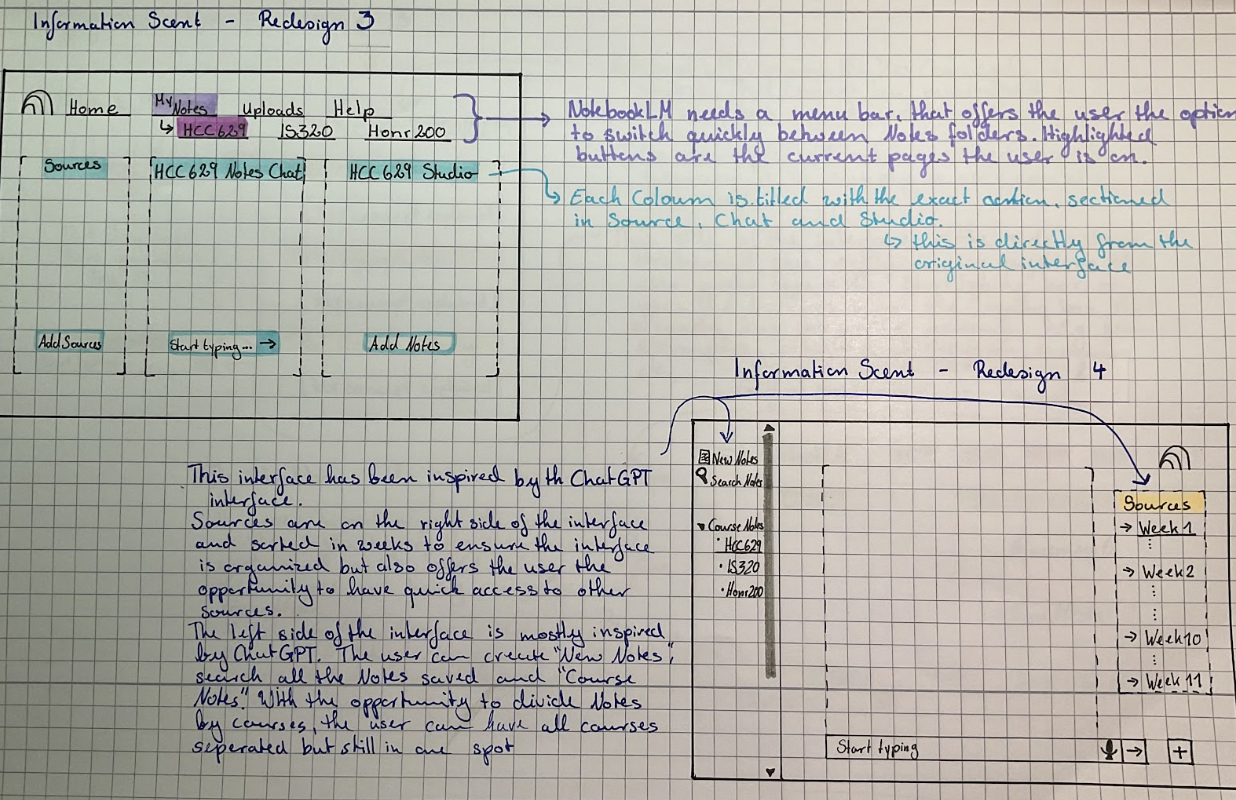
Information Scent
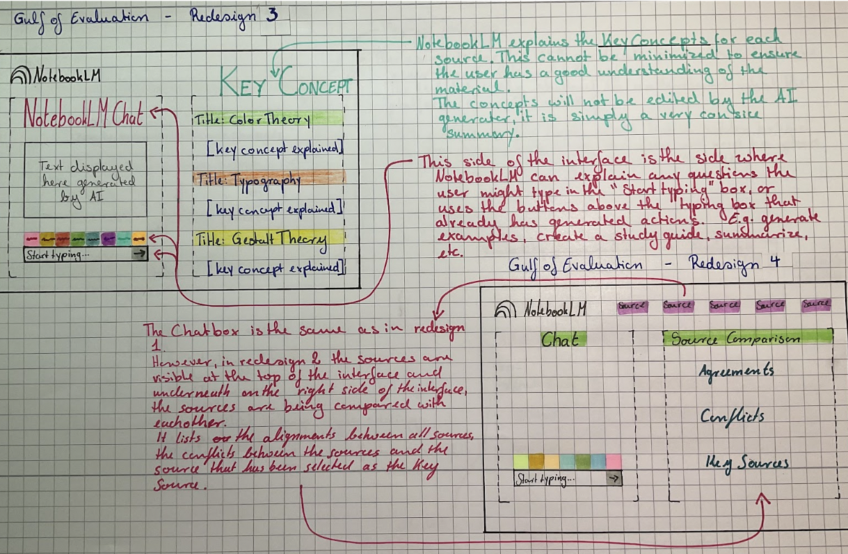
3. Prototype (Sprint 1 → Sprint 2)
Changes made after testing:
Larger action buttons
Breadcrumb navigation
Highlighted AI-used sentences
Standardized layout
“After Uploading” confirmation screen
Final Outcome
Visibility Improvements
Clearer action hierarchy
Immediate feedback after uploading
Larger, more tappable buttons
Information Scent Improvements
Persistent navigation bar
Breadcrumb trail for orientation
Consistent layout across pages
Gulf of Evaluation Improvements
Color-coded text (AI used / paraphrased / added)
Clickable sentence numbers
Renamed "Assessment" → AI-Checker
Clearer interpretation of AI decisions
Reflection & Lessons Learned
User testing shaped every stage—we redesigned not based on assumptions but on observed confusion and delays.
Visibility issues were the easiest to fix but had the biggest time impact.
Gulf of Evaluation was the most meaningful problem—students need to trust AI outputs.
Information scent improved navigation confidence significantly.
Next time, we would:
Prototype earlier
Test more interactive elements
Involve more non-technical users
Expand to mobile variation
Problem statement
Graduate students in HCC 629 rely on NotebookLM to manage dense academic readings, but the platform presents issues in visibility, information scent, and the gulf of evaluation. These usability barriers slow students down, create confusion, and make it difficult to trust AI-generated summaries.
Our goal was to redesign NotebookLM to reduce time-to-task, improve clarity, and help students understand system feedback.