
Zara Website Redesign Using Seven Design Principles
Design process
The redesign of the Zara website followed a structured human-centered design process that included wireframing, heuristic evaluation, and direct interaction testing, all completed using Figma.
Wireframing:
I began by creating low fidelity wireframes in Figma to plan layout changes and reorganize elements such as the product grid, navigation menu, and buttons. This step helped me define the flow of information and improve the user’s browsing path before refining the visual design.
Heuristic Evaluation:
I analyzed the Zara website based on principles discussed in class, including visibility, consistency, feedback, and constraints. By interacting with the website as a user, I identified areas where the experience was unclear or inconsistent, such as hard to read navigation text, small clickable areas, and layout changes that disrupted the user flow. These observations guided the redesign process.
Interaction Testing (User Perspective):
Instead of formal research, I tested the site by navigating and attempting to shop on it as a real user. This hands on approach helped reveal points of frustration, such as unclear navigation, repetitive scrolling, and limited interactive features. Observing these issues directly allowed me to redesign with the user’s experience in mind.
Tools Used:
All redesigns, layouts, and prototypes were created in Figma.
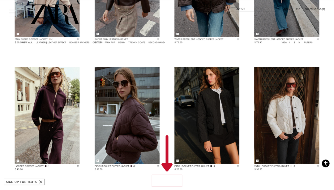
1. Visibility
Issue: The category navigation bar (e.g., View All / Leather) had transparent text that blended into product photos while scrolling.
Why It’s a Problem: This reduces legibility and discoverability; users can’t easily see what category they’re in or what actions are available.
Redesign: Added a solid white background behind the top navigation bar to maintain contrast and legibility across all scroll positions.
Result: Users can clearly see navigation options and their current position at all times, improving orientation.

2. Constraints
Issue: The website required endless scrolling through long product lists without an easy way to return to the top.
Why It’s a Problem: This adds unnecessary effort and reduces efficiency, violating the principle of constraining user actions to clear, manageable steps.
Redesign: Added a fixed “Back to Top” button in the lower corner for quick navigation.
Result: Users can easily return to the main menu or filters without frustration, making browsing more efficient and structured.

Context and problem statement
The Zara e-commerce website is known for its minimalist aesthetic, but several usability and interaction design issues make the shopping experience less intuitive. Key problems included inconsistent layouts, low visibility of navigation, lack of feedback, and inefficient navigation through long product lists.
The goal of this redesign was to apply seven interaction design principles - Visibility, Constraints, Feedback, Consistency, Affordances, Signifiers, and Mapping , to enhance clarity, predictability, and efficiency while maintaining Zara’s brand aesthetic.


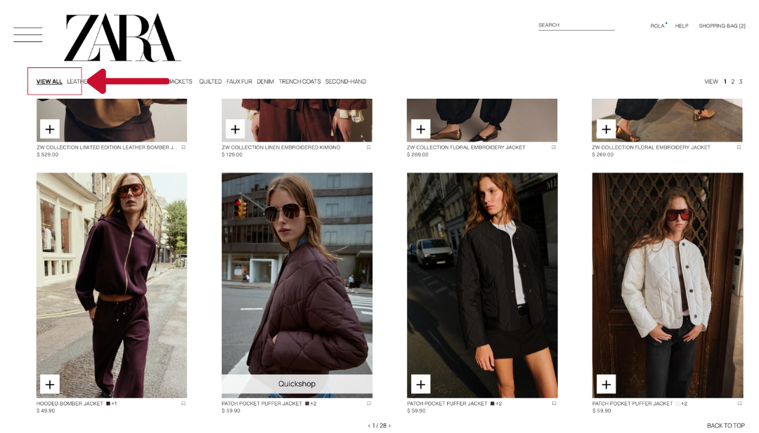
3. Feedback
Issue: Zara’s site did not indicate how many products were visible or when users reached the end of a list.
Why It’s a Problem: Without visual feedback, users can feel unsure if the system is still loading, frozen, or complete.
Redesign: Added pagination indicators (e.g., “1 of 28”) at the end of the page to clearly communicate progress.
Result: Users receive feedback about where they are in the browsing process, reducing uncertainty and enhancing satisfaction.

4. Consistency
Issue: The product layout switched between a four-item grid and a single enlarged image as users scrolled.
Why It’s a Problem: Inconsistent layouts disrupt visual rhythm and make scanning unpredictable.
Redesign: Standardized all pages to a consistent four-item grid layout with uniform spacing and alignment.
Result: Users can browse quickly and comfortably without visual disruption, improving usability and maintaining Zara’s clean aesthetic.


5. Affordances
Issue: On the original Zara website, when users hovered over a product, there was no clear way to view more information or buy without opening a new page.
Why It’s a Problem: The lack of an immediate, visible option limited the perceived affordances—users couldn’t tell that more product details were accessible without extra navigation steps.
Redesign: Added a “Quick Shop” button that appears when users hover over a product card. This overlay allows them to quickly view essential details and add the product to their cart from the same screen.
Result: The “Quick Shop” feature enhances the perceived affordance by making it obvious that users can interact directly with a product card, reducing friction and unnecessary clicks.


6. Signifiers
Issue: The navigation bar didn’t show which section the user was currently viewing.
Why It’s a Problem: Without signifiers, users lose awareness of their location in the browsing hierarchy.
Redesign: Underlined the active category, providing a clear visual indicator of where the user is.
Result: Users can quickly recognize their current section and navigate between categories confidently.

7. Mapping
Issue:
The original “+ Add to Cart” button was small and hard to notice at the bottom corner of each product image.
Why It’s a Problem:
Because the button was too small, users couldn’t easily connect it to the action of adding a specific item to the cart. This weakens the visual relationship between the control and its function.
Redesign:
I made the button larger to clearly show that it belongs to each product and represents the add to cart action.
Result:
The new design improves mapping by strengthening the connection between the product and its control, making interactions faster and more intuitive.
Outcome
The new Zara interface presents a cleaner, more consistent design that incorporates all seven design principles cohesively. Users can now browse intuitively, locate categories easily, interact with product cards efficiently, and shop with fewer clicks.

Reflection
Through this redesign, I learned the importance of applying multiple design principles holistically rather than in isolation. A small visual change, like adjusting a button’s size or adding a background—can significantly improve usability and user flow.
Balancing aesthetics with functionality was key: Zara’s minimalist brand identity had to be maintained while still improving clarity and interaction feedback. This project also reinforced how heuristic evaluation and user feedback complement each other, offering both theoretical and real-world insights.
Overall, the process improved my skills in interaction design, heuristic analysis, and wireframing, while deepening my understanding of how design principles directly shape user experience.
References:
Hudson, W. (2025, January 2). Your gateway to UX design: Norman doors. Interaction Design Foundation.
Interaction Design Foundation. (n.d.). What are affordances? Retrieved 2025 from https://www.interaction-design.org/literature/topics/affordances
Interaction Design Foundation. (n.d.). What are signifiers? Retrieved 2025 from https://www.interaction-design.org/literature/topics/signifiers
Nielsen Norman Group. (2017). Flat UI elements attract less attention and cause uncertainty. https://www.nngroup.com/articles/flat-ui-less-attention/
Norman, D. A. (2008). Signifiers, not affordances. JND.org.
Rekhi, S. (2018). Don Norman’s principles of interaction design (mapping explainer). Medium.
Nielsen, J. (1995). 10 usability heuristics for user interface design. Nielsen Norman Group. https://www.nngroup.com/articles/ten-usability-heuristics/
Norman, D. A. (2013). The design of everyday things (Revised and expanded edition). Basic Books.
Shneiderman, B., Plaisant, C., Cohen, M., Jacobs, S., Elmqvist, N., & Diakopoulos, N. (2016). Designing the user interface: Strategies for effective human-computer interaction (6th ed.). Pearson.
Tullis, T., & Albert, B. (2013). Measuring the user experience: Collecting, analyzing, and presenting usability metrics (2nd ed.). Morgan Kaufmann.
We used ChatGPT to brainstorm ideas and organize our text structure. We also used Grammarly to refine grammar and clarity, as we are both non-native English speakers.
By Rola Hussein & Boris Milev